
Ant Design Based Widgets Published on Mendix Marketplace
1. About Us
Mindrose Team is a professional technical service team. At the current stage, we mainly provide enterprise digital, intelligent, and mobile application system construction and development based on the Mendix low-code platform, and provide automation and process-based business empowerment based on AI capabilities.
The team consists of Mendix senior/intermediate certified developers and AI explorers, all with rich experience and capabilities in enterprise information consulting, development, and implementation.

2. Component Overview
The Mx Antd Button and Popconfirm components developed by our team member Gavin are part of the Mendix-Antd project led by the Mendix China team. This project strives to bring antd components to the Mendix world to help Mendix developers focus more on business functionality rather than UI component implementation.
Project Github address: Mendix Antd Widget Show
Project Demo address: Mendix Antd Widget Demo
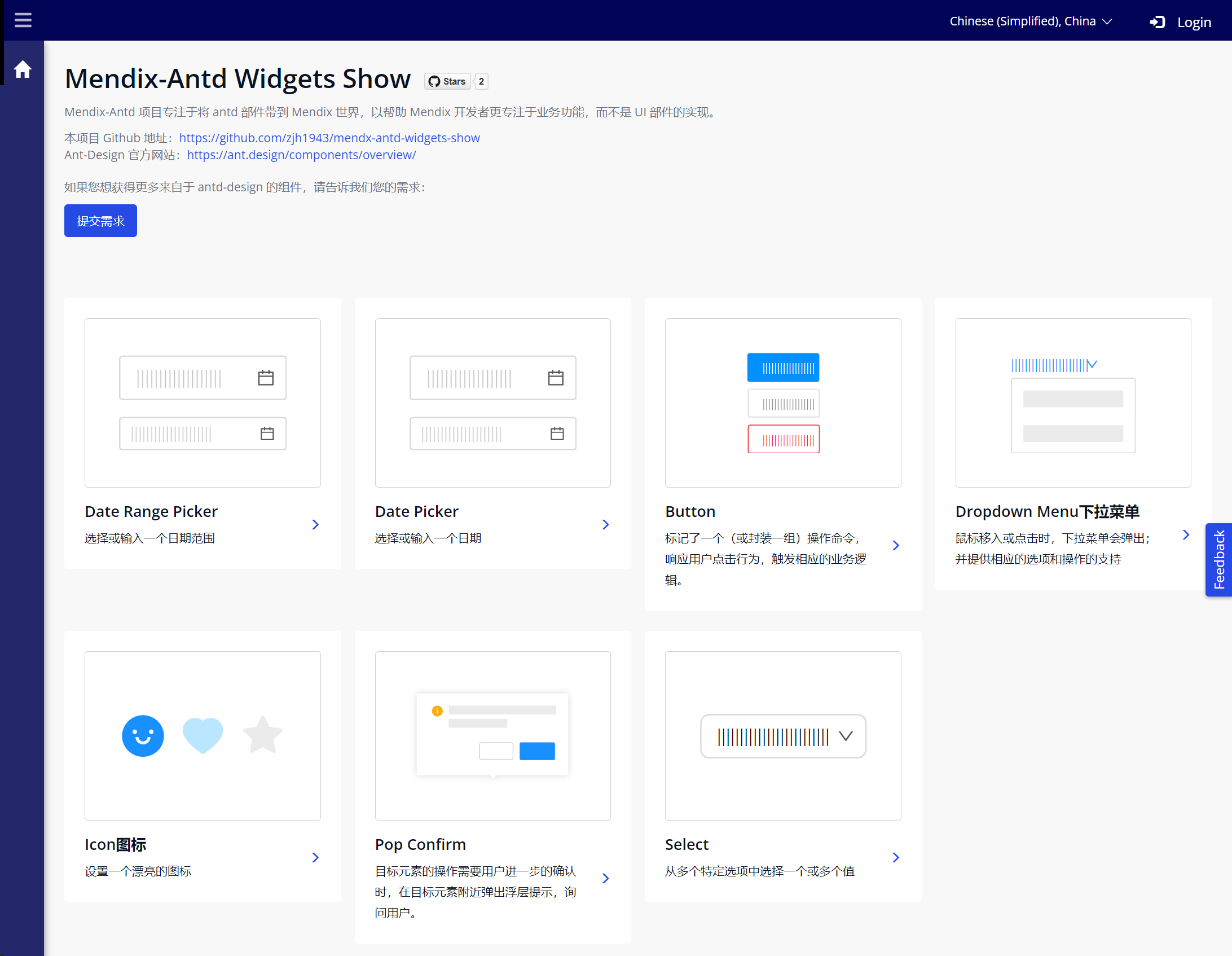
Here are the introductions of the two components:
- Mx Antd Button: A Mendix Pluggable Widget based on Ant Design Button component, marking (or encapsulating) operation commands, responding to user click behavior, and triggering corresponding business logic.
- Mx Antd PopConfirm: A Mendix Pluggable Widget based on Ant Design PopConfirm component, providing a fully functional pop-up floating confirmation dialog. Compared with pop-up full-screen centered modal dialogs, the interaction form is lighter.
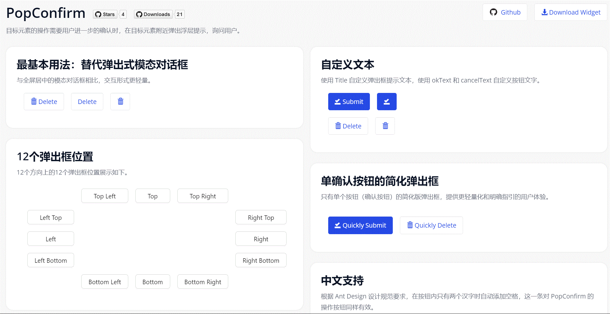
3. Mx Antd PopConfirm Component
Here's a simple operation example:
This Demo project can be accessed through this link: Mendix Antd Widget Demo
The component Github Repo is here, if needed you can customize based on this component or contact us: Github Repo
3.1. Component Features
- Provides dialog title rendering with Mendix textTemplate text assembly capability.
- Customizable Confirm/Cancel button text.
- Customizable dialog relative position (placement), default includes 12 types.
- Customizable dialog CSS styles through Class Name in configuration.
- Besides the default style with dual buttons, can define simplified style with only Confirm button.
- Container can accommodate various types of Mendix Widgets (supporting OnClick event).
3.2. Component Installation and Usage
- Download the mpk file from Marketplace or Github Release and add it to the project directory
{YourMendixProjectFolder}/widgets/, or download directly through Marketplace in Studio Pro. - Select any page, add an
Antd PopConfirmto the page. - Add child components to the above
PopConfirm, which can beButton,Antd Button,Badge,Text,Labeland other components. To implement dynamic Title text, the PopConfirm component needs to be placed in a Data container component.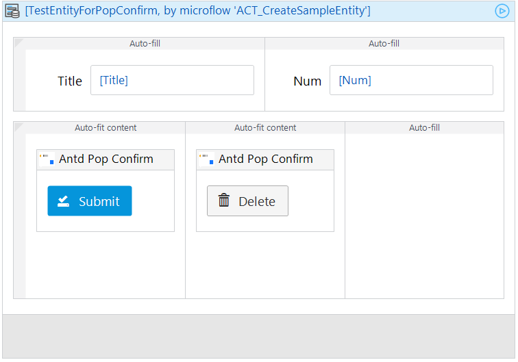
- Set necessary properties for the component. Including:
Title,Placement,Confirm Text,Confirm Event,Cancel Text,Cancel Event.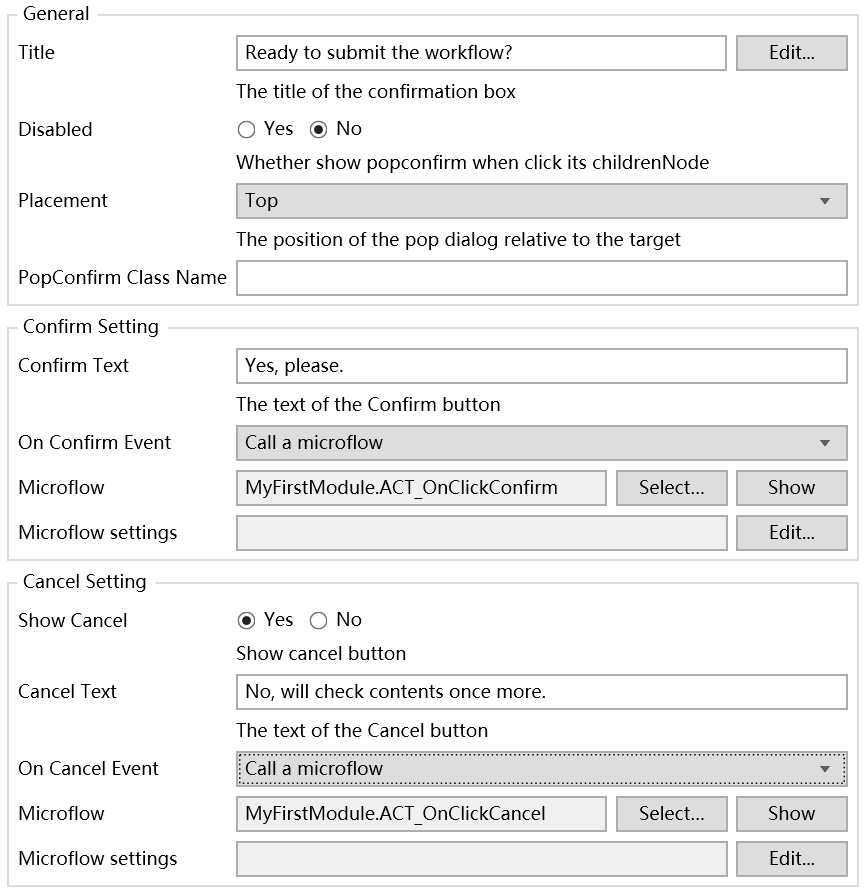
- Run and confirm the effect.
3.3. Component Configuration Description
General Section
- Title: Pop-up dialog title.
- Disabled: Whether to disable the pop-up dialog, default is
No. - Placement: Pop-up dialog position relative to child components, 12 options in total.
- Class Name: Pop-up dialog style.
Confirm Setting Section
- Confirm Text: Confirm button text.
- On Confirm Event: Click confirm button event.
Cancel Setting Section
- Show Cancel: Whether to show cancel button, default is
Yes. - Cancel Text: Cancel button text.
- On Cancel Event: Click cancel button event.
4. Mx Antd Button Component
Here's a simple operation example:
This Demo project can be accessed through this link: Mendix Antd Widget Demo
The component Github Repo is here, if needed you can customize based on the source code or contact us: Github Repo
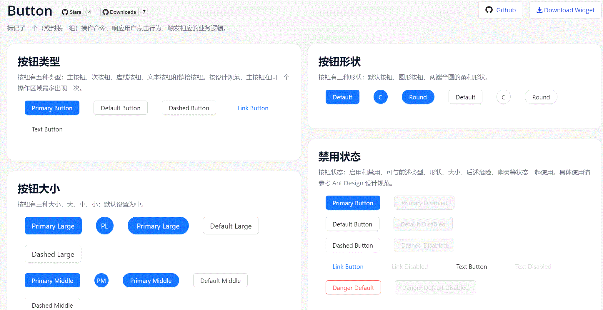
4.1. Component Features
-
We provide five types of buttons in Ant Design.
- Primary Button: Used for primary action points, only one primary button in an operation area.
- Default Button: Used for a group of action points without primary/secondary distinction.
- Dashed Button: Commonly used for adding operations.
- Text Button: Used for the least important action points.
- Link Button: Generally used for links, i.e., navigation to certain locations.
-
And three status properties to use with the above.
- Danger: Dangerous operations like delete/move/modify permissions, generally need secondary confirmation.
- Ghost: Used in places with complex background colors, commonly used in homepage/product page and other display scenarios.
- Disabled: When action points are unavailable, generally needs text explanation.
-
Provides three size levels: large, medium, and small.
-
Provides three shape options: Default, Circle, and Round.
-
Provides Block setting for implementing parent container full-width buttons.
4.2 Component Installation and Usage
- Download the mpk file from Marketplace or Github Release and add it to the project directory
{YourMendixProjectFolder}/widgets/, or download directly through Marketplace in Studio Pro. - Select any page, add an
Antd Buttonto the page. - Set necessary properties for the component. Including:
Caption,Type,Shape,Size,Block,OnClick Event, etc.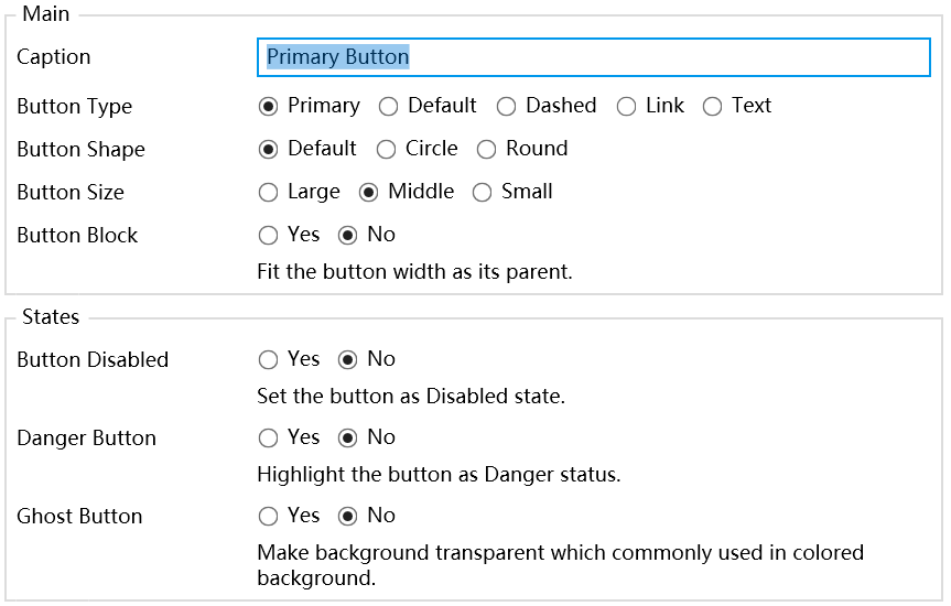
- Run and confirm the effect.
4.3. Component Configuration Description
Main Section
- Caption: Button text.
- Button Type: Set button type.
- Button Shape: Set button shape.
- Button Size: Set button size.
- Button Block: Set whether it's a full-width button.
Status Section
- Disabled: Whether to disable button event, default is
No. - Danger: Whether it's a danger button, default is
No. - Ghost: Whether it's a ghost button, default is
No.
Event Section
- OnClick Event: Click button event.
5. Design Philosophy and Future Plans
The Button component design is based on Ant Design's Button component, adopting Ant Design's clean and crisp design style and color specifications to adapt to richer Mendix usage scenarios. The rich button types allow pages to achieve richer visual hierarchy and detail design, and these different types and sizes make it convenient for developers to choose and use appropriate buttons to meet various operation and page requirements.
The PopConfirm component aims to provide a simple pop-up confirmation box where developers can implement operations that need user confirmation through this component. Its design is also based on Ant Design, adopting Ant Design's clean pop-up design and interaction method. On this basis, we provide "confirm" and "cancel" buttons by default, making it easy for developers to pop up prompts for users to confirm certain operations or decisions through this component. This component implements a common interaction requirement for Mendix developers, simplifying the development effort of implementing native confirmation pop-ups, making interface design and interaction more efficient and lightweight. At the same time, its combination with the Button component can meet most basic page design requirements.
If you have further ideas and requirements, please feel free to share. We will continue to deepen our work in subsequent efforts.
Cover Image by Vilius Kukanauskas from Pixabay.