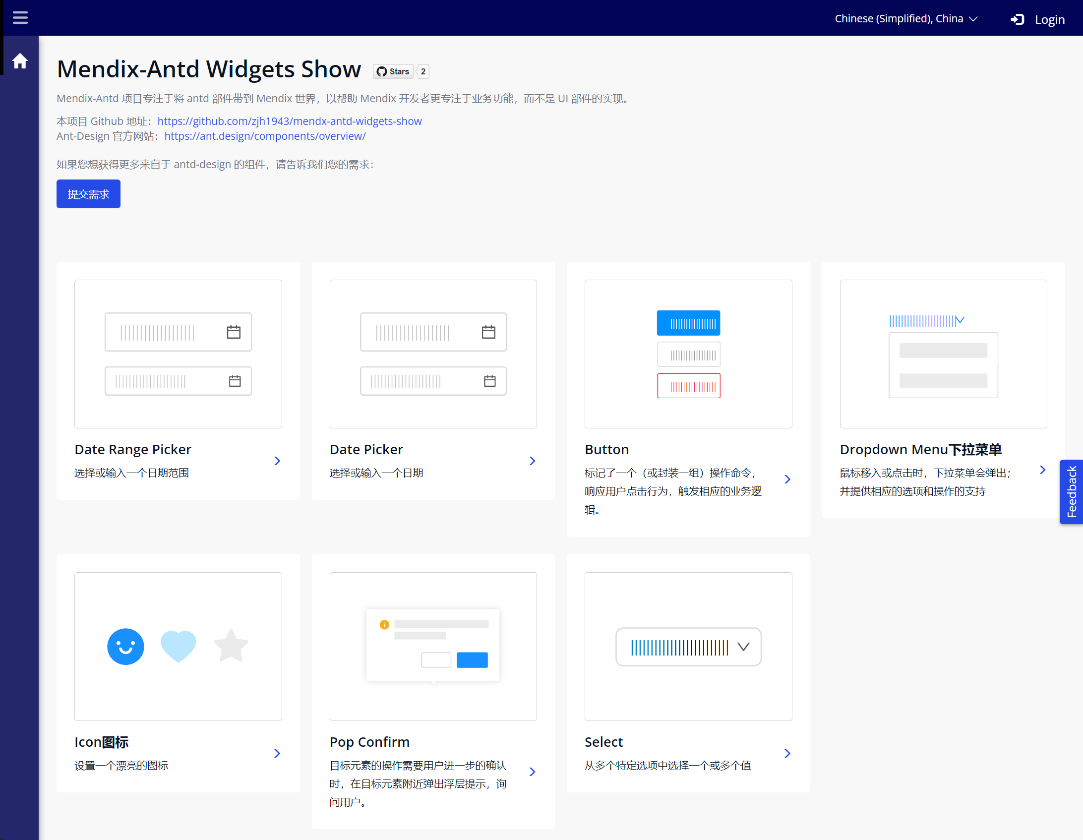

1. Component Introduction
Mx Antd Button: A Mendix Pluggable Widget based on Ant Design Button component, marking a single (or encapsulating a group of) operation command, responding to user click behavior, and triggering corresponding business logic.
2. Mx Antd Button Component
The Button component's design is based on Ant Design's Button component, adopting Ant Design's clean and quick design style and color specifications to adapt to richer Mendix usage scenarios. The rich button types allow pages to achieve richer visual hierarchy and detail design, and these different types and sizes make it convenient for developers to select and use appropriate buttons to meet the needs of various operations and pages.
Simple operation example as follows:
This Demo project can be accessed through this link: Mendix Antd Widget Demo
The component's Github Repo is here, you can also customize it based on the source code or contact us if needed: Github Repo
2.1. Component Features
-
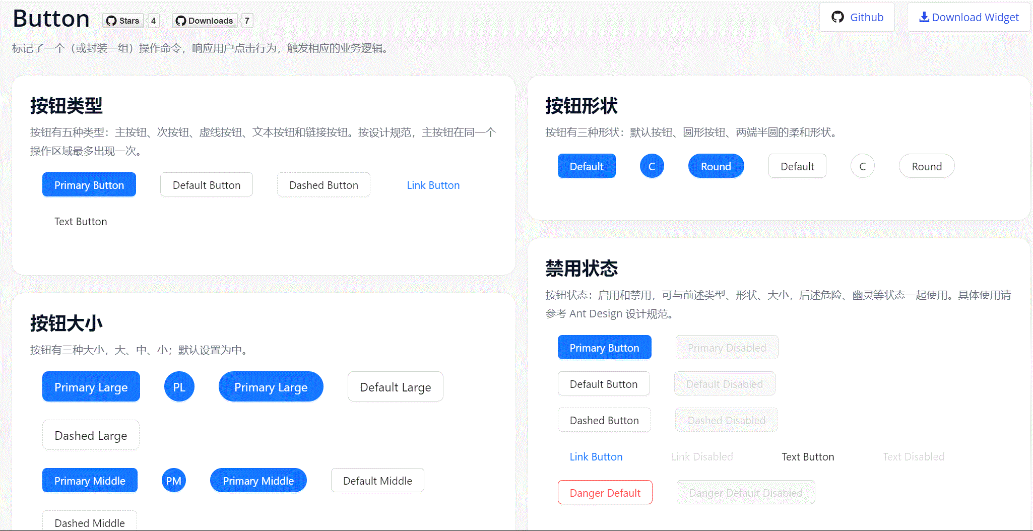
We provide five types of buttons in Ant Design.
- Primary button: Used for primary action points, only one primary button is allowed in an operation area.
- Default button: Used for a group of action points without primary/secondary distinction.
- Dashed button: Commonly used for adding operations.
- Text button: Used for the least important action points.
- Link button: Generally used for links, i.e., navigation to a location.
-
And three status properties to use in combination with the above.
- Danger: For dangerous operations like delete/move/modify permissions, usually requiring secondary confirmation.
- Ghost: Used in places with complex background colors, commonly used in homepage/product page and other display scenarios.
- Disabled: When action points are unavailable, usually requiring text explanation.
-
Provides three size levels: large, medium, and small.
-
Provides three shape options: Default, Circle, and Round.
-
Provides Block setting for implementing full-width buttons in parent containers.
2.2. Component Installation and Usage
- Download the mpk file from Marketplace or Github Release and add it to the project directory
{YourMendixProjectFolder}/widgets/, or download directly through Marketplace in Studio Pro. - Select any page and add an
Antd Buttonto the page. - Set necessary properties for the component, including:
Caption,Type,Shape,Size,Block,OnClick Event, etc.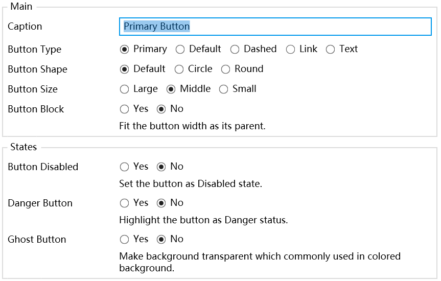
- Run and verify the effect.
2.3. Component Configuration Items Description
Main Section
- Caption: Button text.
- Button Type: Set button type.
- Button Shape: Set button shape.
- Button Size: Set button size.
- Button Block: Set whether it's a full-width button.
Status Section
- Disabled: Whether to disable button events, default is
No. - Danger: Whether it's a danger button, default is
No. - Ghost: Whether it's a ghost button, default is
No.
Event Section
- OnClick Event: Button click event.
Component Project Engineering
This is the Mx Antd Button and Popconfirm component developed by our team member Gavin before leaving the Siemens Mendix team. It is part of the Mendix-Antd project led by the Mendix China team, which strives to bring antd widgets to the Mendix world to help Mendix developers focus more on business functionality rather than UI widget implementation.
Project Github address: Mendix Antd Widget Show
Project Demo demonstration address: Mendix Antd Widget Demo