
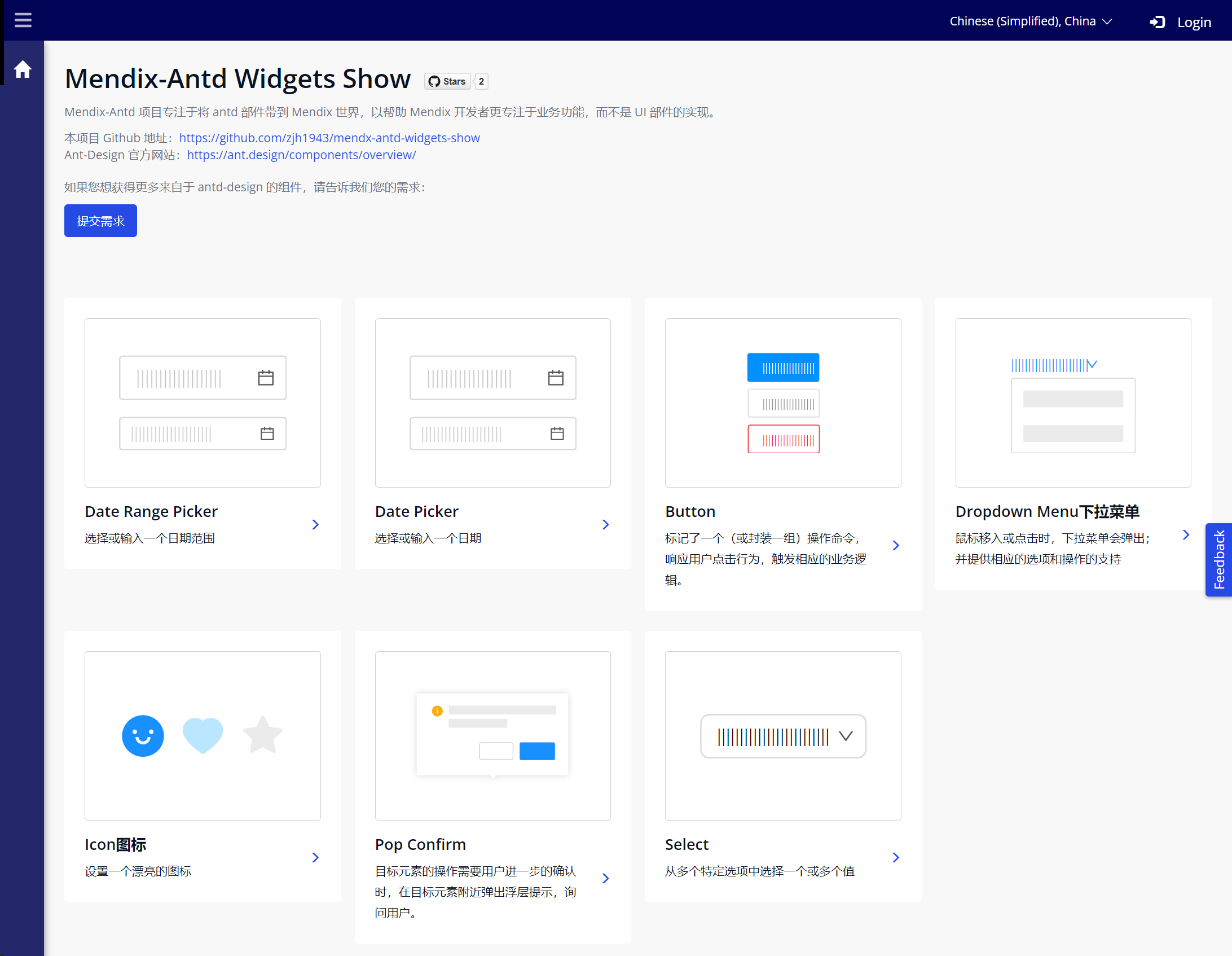
1. Component Introduction
Mx Antd PopConfirm: A Mendix Pluggable Widget based on Ant Design PopConfirm component, providing a fully functional floating confirmation dialog. Compared to popup modal dialogs centered on the full screen, the interaction form is lighter.
2. Mx Antd PopConfirm Component
The PopConfirm component aims to provide a simple confirmation dialog box where developers can implement operations that require user confirmation. Its design is also based on Ant Design, adopting Ant Design's clean dialog design and interaction method. On this foundation, we provide "Confirm" and "Cancel" buttons by default, making it easy for developers to create popups that prompt users to confirm an action or decision through this component. This component implements a common interaction requirement for Mendix developers, simplifying the development effort of implementing native confirmation dialogs, making interface design and interaction more efficient and lightweight. At the same time, its combination with the Button component can meet the design requirements of most basic pages.
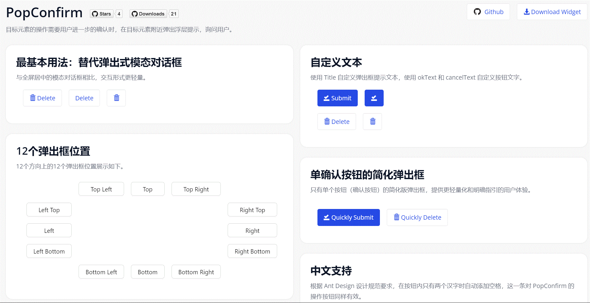
Simple operation example as follows:
This Demo project can be accessed through this link: Mendix Antd Widget Demo
The component's Github Repo is here, you can also customize it based on this component or contact us if needed: Github Repo
2.1. Component Features
- Provides dialog title rendering capability based on Mendix textTemplate text assembly.
- Customizable Confirm/Cancel button text.
- Customizable dialog relative position (placement), with 12 default options.
- Customizable dialog CSS styles through Class Name in configuration items.
- Besides the default style with dual buttons, a simplified style with only Confirm button can be defined.
- Container can accommodate various types of Mendix Widgets (as long as they support OnClick events).
2.2. Component Installation and Usage
- Download the mpk file from Marketplace or Github Release and add it to the project directory
{YourMendixProjectFolder}/widgets/, or download directly through Marketplace in Studio Pro. - Select any page and add an
Antd PopConfirmto the page. - Add child components to the above
PopConfirm, which can beButton,Antd Button,Badge,Text,Label, and other components. To implement dynamic Title text, the PopConfirm component needs to be placed in a Data container component.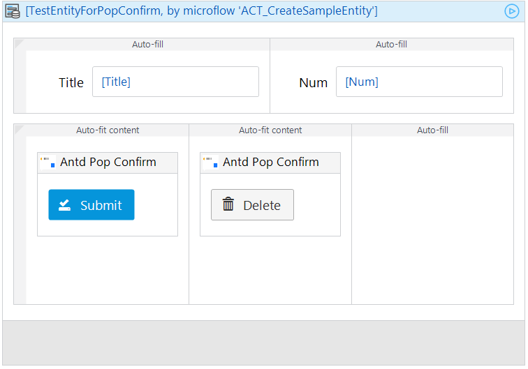
- Set necessary properties for the component, including:
Title,Placement,Confirm Text,Confirm Event,Cancel Text,Cancel Event.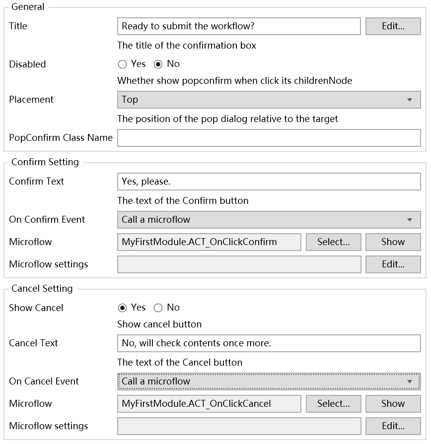
- Run and verify the effect.
2.3. Component Configuration Items Description
General Section
- Title: Dialog title.
- Disabled: Whether to disable the dialog, default is
No. - Placement: Dialog position relative to child components, with 12 options.
- Class Name: Dialog style.
Confirm Setting Section
- Confirm Text: Confirm button text.
- On Confirm Event: Click confirm button event.
Cancel Setting Section
- Show Cancel: Whether to show cancel button, default is
Yes. - Cancel Text: Cancel button text.
- On Cancel Event: Click cancel button event.
Component Project Engineering
This is the Mx Antd Button and Popconfirm component developed by our team member Gavin before leaving the Siemens Mendix team. It is part of the Mendix-Antd project led by the Mendix China team, which strives to bring antd widgets to the Mendix world to help Mendix developers focus more on business functionality rather than UI widget implementation.
Project Github address: Mendix Antd Widget Show
Project Demo demonstration address: Mendix Antd Widget Demo